
Nipaluna's Need for Public Transport
Forced car ownership, high emissions, and traffic jams—Hobart’s car-first design isn’t working. Better public transport is the key to a fairer, greener city.


A Nightmare
You wake up, late. The alarm didn’t go off. None of the kids are ready for school. They’re stuck in front of the morning cartoons. You rush to get them all fed, packed and into the car. The windshield is frozen. You wait for it to defrost as the kids are screaming in the back.
You’re finally on the road but you have to make multiple stops. The kids schools are all in different parts of town. One of these locations goes against the traffic, but by the time you’ve dropped one kid off there, you have to go with the traffic to the next drop off. With the kids all dropped off, you head to work. You’re sitting in a traffic jam and notice most cars only have one other person in them, how weird.
You’re late but you finally make it to the CBD. The car park is full. So you have to pay for street parking and move your car every two hours. One of your meetings goes overtime so you miss the window to move your car and cop a parking fine. You finish work and now have to pick up the kids from school. The afternoon traffic is back. It takes 45 minutes just to drive to both schools and now you need to get home to cook dinner for the family. This is a usual day for you.
What if I told you the way to prevent days like this is robust public transport options?
Why Nipaluna — Hobart does not have good Public Transport
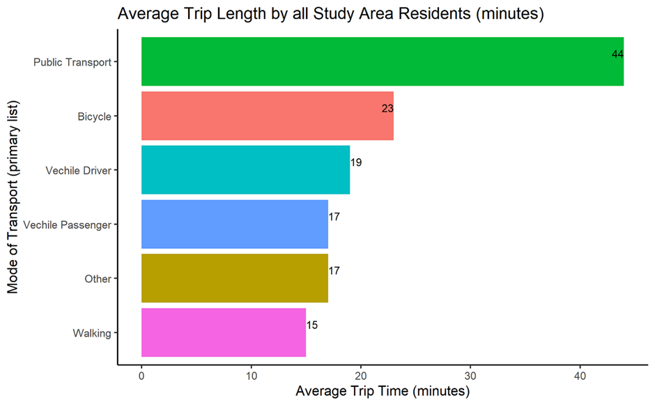
After decades of car-centric urban planning, we know that Nipaluna has not been designed well for Public Transportation (Nipaluna is the Muwinina name for the country where Hobart sits today). According to the Greater Hobart Household Travel Survey from 2023, the average daily travel time by public transport was 44 minutes per day. This is a full 21 minutes more travel time than the second longest travel option (Bicycle, at 23 minutes) and 25 minutes longer than the average of all modes of transport (19 minutes).
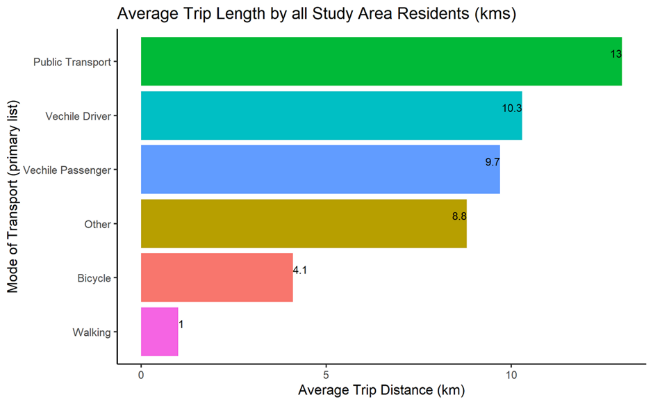
This becomes even more stark when we see that public transport options are so poorly serviced that the average daily travel distance for public transport is 13km per day. The longest travel option, at 3km more distance travelled than by car (not including a passenger) as well as ~4km more travel distance than the average of all methods (8.7km).
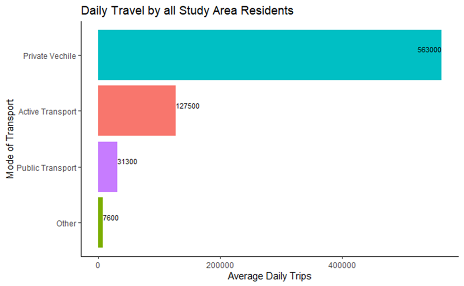
Thus, it is not difficult to see why people in Nipaluna opt to not use public transport as their main mode of transport. There are more alternative options (especially in cars) that make taking public transport an unattractive option. This is further evidenced by the approximately 563,000 of 729,400 (77%) total average trips per day in Nipaluna being completed by a Private Vehicle (car or other personal vehicles). Both active transport (17%, incl walking, bicycle etc.) and public transport (4%) make up only 21% of the total daily average trips (the last 2% belongs to other modes of transport).
This all bodes bad news for public transport in Nipaluna. But why should we care?
Why should we care?
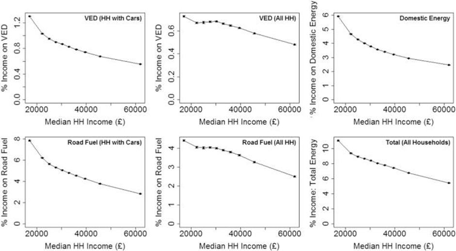
Cars tend to be associated with “freedom”. However, this facade hides the significant costs associated with car dependence. This is not just the financial costs of cars directly to the local council and State government via road and infrastructure maintenance (more to come on this). Existing research shows how costs associated with cars have a regressive effect on the distribution of income (Chatterton, T., et al., 2018).
“The findings indicate that motoring costs are strongly regressive, with lower income areas, especially in rural locations, spending around twice as much of their income on motoring costs as the highest income areas.” (Chatterton, T., et al., 2018)
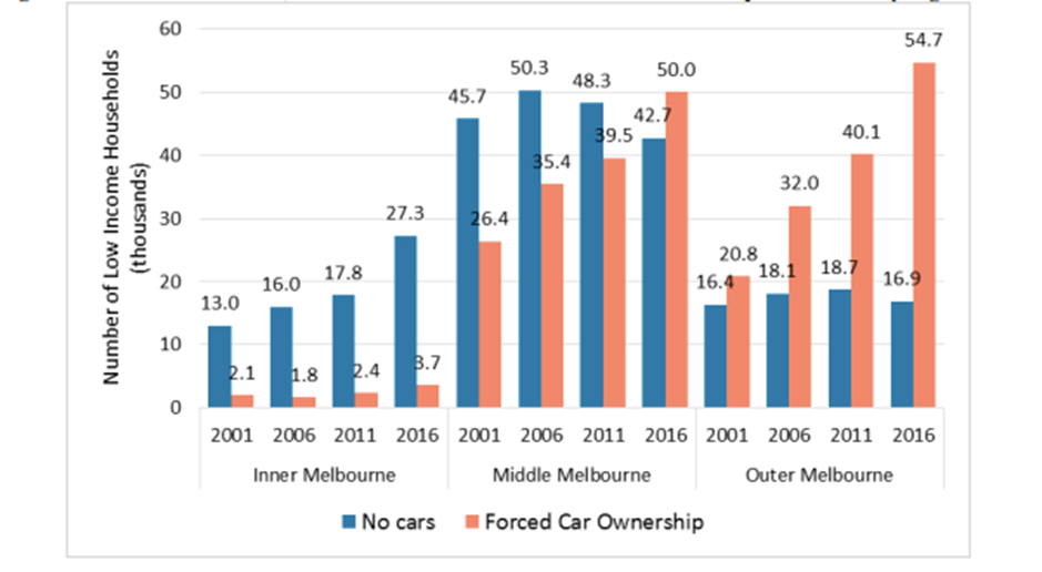
Furthermore, Australian research (Currie, G., et al., 2018) highlights the growing issue of “forced car ownership” (FCO). FCO is a phenomenon where low-income households have minimal other transport alternative available such that they are “forced” to purchase a car, and in turn take on the personal costs associated with car ownership. The research found FCO has increased by 36% between 2011 and 2016 in Melbourne. The effects are also quite prominent in Melbourne’s outer suburbs where public transport options are not as readily available. Something people in the outer suburbs of Nipaluna likely know very well.
So, there is an obvious equity aspect to good public transport. People should not be required to spend a significant proportion of their income just to get around. This should be argument enough to offer robust public transport as an alternative to car ownership.
However, I do anticipate that this will not convince everyone of the necessity to increase investment in public transport throughout Nipaluna. I have repeatedly heard some variation of the argument “if we just prioritised building more car infrastructure, we could solve the traffic issues!” But is this true?
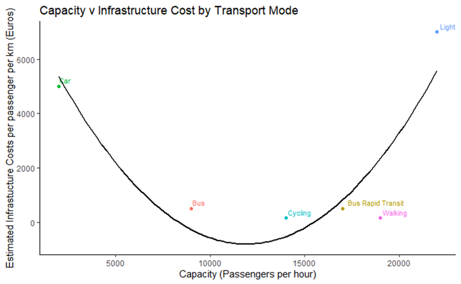
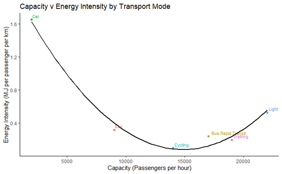
This requires answering the question, “what is the most efficient mode of transport”? Well this requires a briefly explanation a measure called “corridor capacity”. Simply, it is a measure of how many people a mode of transport can comparably move in the same timeframe. Typically represented by passengers per hour. To illustrate this we can look at figure 6 below. It is from the Global Energy Assessment: Toward a Sustainable Future (GEA, 2012):
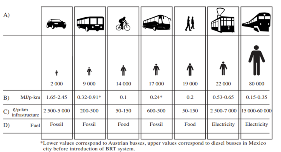
The table compares the corridor capacity (second row) for key modes of transport along with the energy intensity (third row) and infrastructure cost per passenger in Euros (fourth row) as well as the most dominant fuel type used for that mode of transport (fifth row). The most interesting thing you’ll immediately notice is the corridor capacity of cars is the lowest of all the transport modes.
If we want to have a coherent discussion about the efficiency of transportation, we need to highlight just how inefficient cars really are as a mode of transport. Cars typically only carry one or two people (most people do not carpool). So as a proportion of space used, cars take up a lot of space and move relatively few people. This has been displayed many times by comparing the space a group of people take up and the corresponding space the different mode of transport take up, like this:
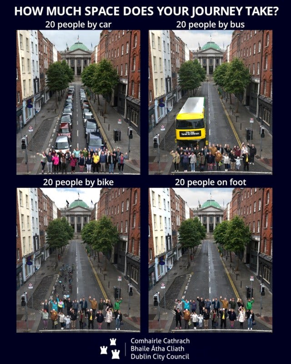
Similarly, cars have to be parked somewhere when not being used. Whilst other public transport can keep on going for the rest of the day, not taking up space by parking and transporting more people. This inefficiency becomes even more obvious when we consider the energy efficiency and infrastructure costs of cars.
Figure 6 also shows the infrastructure costs associated with cars to be at ~€2.5–5k per km of infrastructure. Because these figures are in euros and don’t account for inflation, they’re a bit confusing. So to get a better idea of what they’re saying, we can compare how relatively expensive each mode of transport is compared to cars. Using the conservative end of the estimates, cars are 12.5x more expensive than buses as well as 50x more expensive than cycling or walking when measured per km travelled.
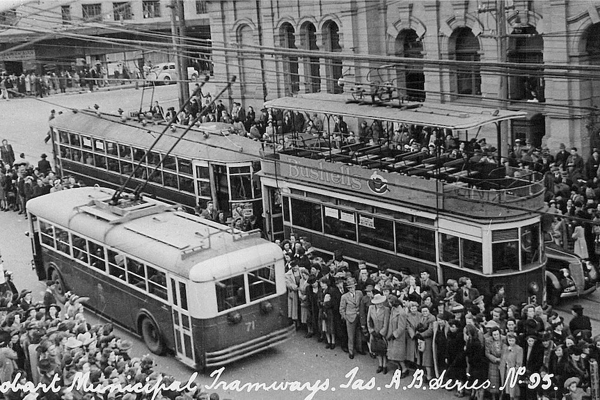
Just to round out this comparison for modes of transport not available in Nipaluna, cars are 3x as expensive as Bus Rapid Transit and are comparable to the costs of Light Rail! Why where the double decker electric trams ripped out of the ground again?
We can illustrate the trade-off between cost and corridor capacity in the graph below:
But the costs of cars doesn’t just stop at the finances. There are also significant costs associated with energy efficiency and in turn the impact on the environment. Globally, “The transportation sector is responsible for approximately 28% (91 EJ) of global final energy demand” (GEA, 2012). Given the car-centric nature of transportation in Nipaluna, it’s energy demand mix is likely relatively similar.
Figure 6 details the relative inefficiency of cars compare to the other modes of transport. Relative to the high-end efficiency estimate of MJ per passengers per hour for cars (1.65 MJ/passengers/hour), buses (0.32 MJ/passengers/hour) are 5x more efficient than cars, cycling (0.1 MJ/passengers/hour) is 16.5x more energy efficient than cars and walking (0.2 MJ/passengers/hour) is 8.25x more energy efficient than cars.
Similarly, the trade-off between energy intensity and corridor capacity can summarised by the below graph:
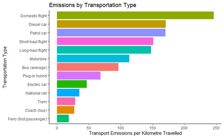
This is further supported by evidence highlighting transport alternatives to cars emit significantly less Green House Gas emissions per km travelled.
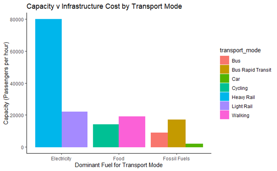
Interestingly, it is also clear that “Fossil Fuels” as the dominant source of fuel for each mode of transport has the lowest levels of corridor capacity amongst the examined transport modes:
So on all measures; financial, energy efficiency, fuel mix, environmental and equity it seems public transport is knocking cars out of the park. However, I anticipate the typical Neo-liberal retort being “Have you seen the state of the budget? How can we possible afford to change our transportation mix now?”. Yes, the budget is in a horrendous position thanks to austerity policies. But I then see this more as an argument in favour of a robust public transport mix that costs less over the long run, don’t you think? However, in the spirit of discussion let me take this point seriously.
A crude comparison
As an Economist, I don’t actually know much about traffic & infrastructure engineering. Unlike the typical Economist, I might leave this part to the professionals. The Department of State Growth contracted Pricewaterhouse Coopers (yes that PWC) to complete a multi-criteria analysis (MCA) for a northern corridor public transportation development. Various options were considered but the final analysis was completed on light rail, bus rapid transit and trackless tram. The report generally concluded:
“The MCA revealed positive transport service results for all three mass transit options. The results for transport service outcomes showed little variation between options. Each were found to offer a high capacity public transport option and if run at a frequent headway able to reduce Hobart’s reliance on cars and improve congestion.” (PWC, 2020)
In terms of costs, PWC produced these preliminary costings for the three projects:
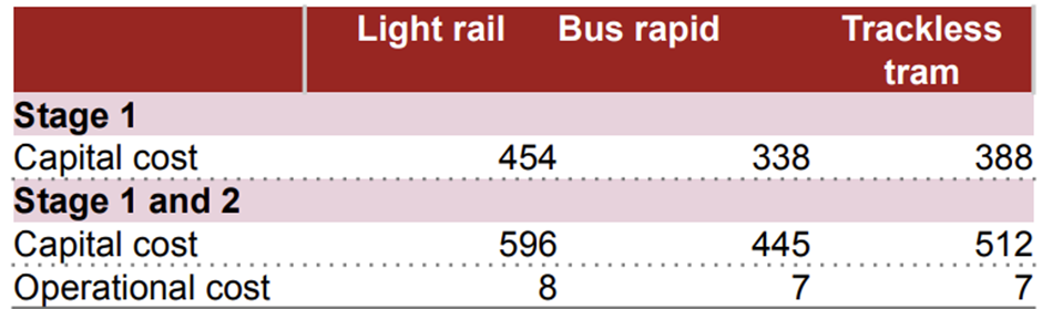
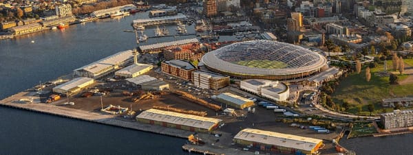
Construction costs are between ~$450-600M dollars for the three options with ~$7–8M in annual operation costs. This is helpful, but what is the scale of these numbers? To put these numbers into perspective we can compare them to the cost of another infrastructure project, a Stadium.
Adopting the most expensive option from the MCA, the light rail development, it would cost ~77% of the earlier $775M dollars estimated for the stadium construction, or ~63% of the more recent $945M construction cost estimate (not to mention the independent estimate of $1.1B). So, it is possible that we could pay for nearly two light rail corridors for the price we’re estimated to pay for one stadium!
This is a very unrobust exercise. These figures are preliminary estimates and are in 2018–19 dollars, so inflation will have changed these figures by now. The point was not to prove that public transport would not cost anything. The exercise is illustrative of the point that the current car infested hellscape we live in is not “cost free”.
We are paying for car dependence with high traffic times. Land close to the CBD is being used for parking instead of new housing. An increased risk of injury and death from bigger cars that are used more often due to a lack of alternatives. Not to mention the environmentally catastrophic outcomes from car dependence such that Lutruwita is known as the roadkill capital of the world. Cars do not offer us “freedom” when they put these burdens on all of us. The “freedom” promised by car dependence is the nightmare experienced at the start of this essay.
What we need is more public transport options, and to complement that, an alternative urban planning policy. On top of robust public transport alternatives to cars, we need more mixed used and walkable suburbs, more bike lanes that don’t “lead to no where” and a true participatory democracy for an alternative urban planning policy. Across all the dimensions we’ve explored, we are all better off when we base our urban planning around robust public transport and alternative modes of transportation to cars. So, what are we waiting for?!
References
“Greater Hobart Household Travel Survey” (2023) Published online at https://www.tas.gov.au/. Retrieved from: ‘https://www.transport.tas.gov.au/managing_the_roads/traffic_in_tasmania/greater_hobart_household_travel_survey' [Online Resource] on 10 June 2025
Hannah Ritchie (2023) — “Which form of transport has the smallest carbon footprint?” Published online at OurWorldinData.org. Retrieved from: ‘https://ourworldindata.org/travel-carbon-footprint' [Online Resource] on 10 June 2025
PWC (2020) — “Northern Suburbs Transit Corridor: Transport Mode Study: Options Assessment Report” Published online at https://www.stategrowth.tas.gov.au/. Retrieved from: ‘https://www.stategrowth.tas.gov.au/__data/assets/pdf_file/0006/271707/Northern_Suburbs_Transit_Corridor_Transport_Mode_Study_Final_Summary_Report.PDF' [Online Resource] on 10 June 2025